Why should we engage in research?
There is a clear directive in Australia to promote and embed high quality research in health services as evidenced by:
- The recommendations of the “Strategic Review of Health and Medical Research in Australia – Better Health” – otherwise known as the McKeon Strategic Review
- The National Health and Medical Research Council’s (NHMRC) recognition of Advanced Health Research & Translation Centres (AHRTC) and Centres for Innovation in Regional Health (CIRH) – academic science super centres of high calibre research capacity and translation (potential)
These centres, among which a number are recognised in NSW, have comprehensively demonstrated their capability to develop, lead, conduct and translate health and medical research into policy and practice as part of their applications to be recognised by the NHMRC. Therefore, these centres probably have amongst the highest levels of research capability and capacity throughout the country.
Sphere: major partners include UNSW, SESLHD, SWSLHD, UTS & UWS
![]()
Sydney Health partners: major partners include The University of Sydney, SLHD, NSLHD and WSLHD

NSW Regional Health Partners: major partners include The University of Newcastle, HNELHD, MNCLHD and CCLHD

It is widely accepted that embedding research in health systems has many benefits,1–5 including:
- Advancing knowledge of health and disease
- Identifying novel treatments and models of care
- Improving patient health outcomes and reducing mortality
- Building a culture of quality and excellence
- Reducing low-value care (waste) and adverse events
- Promoting more rapid uptake of new evidence and therapies
- Driving a culture of evidence-informed practice
- Providing a sense of contribution to improved care for other/future patients by clinicians and patients
References
- McKeon, S. et al. Strategic Review of Health and Medical Research. (2013).
- Boaz, A., Hanney, S., Jones, T. & Soper, B. Does the engagement of clinicians and organisations in research improve healthcare performance: a three-stage review. BMJ Open 5, (2015).
- Krzyzanowska, M. K., Kaplan, R. & Sullivan, R. How may clinical research improve healthcare outcomes? Ann. Oncol. Off. J. Eur. Soc. Med. Oncol. 22 Suppl 7, vii10-vii15 (2011).
- Ozdemir, B. A. et al. Research activity and the association with mortality. PloS One 10, e0118253 (2015).
- Downing, A. et al. High hospital research participation and improved colorectal cancer survival outcomes: a population-based study. Gut 66, 89–96 (2017).
Simplified research framework – the scientific method
What is research? And how do we go about doing it? Research is a formalised process of discovery or knowledge creation underpinned by the scientific method.
The following simplified scientific method can be used as a starting point for research. Writing to each of the parts forms a nice basis for a research proposal.
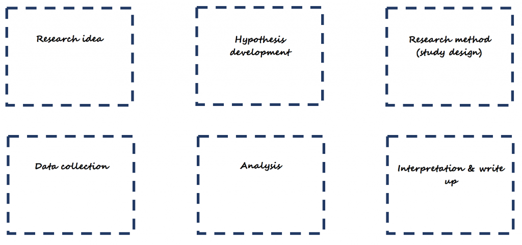
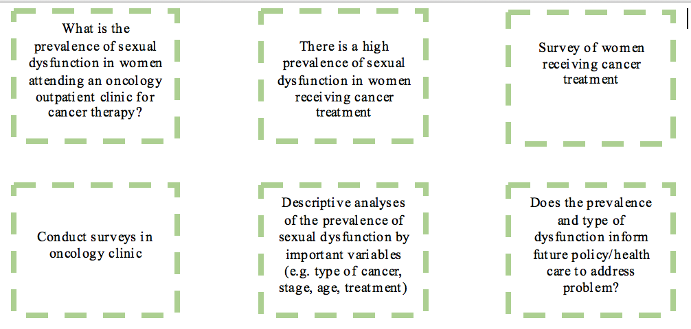
Consider the following example:

Tip: Once you have written to each part of the simplified scientific method, download or find a template research protocol, and start preparing the research protocol for your project by expanding on what you have written.
Research Translation Framework
In the current environment, where there is a major focus, state wide and nationally, to drive and embed high quality research in health services, research takes on a central role. It is now, more than ever, recognised that investment in research (e.g. in-kind, financial) must lead to better returns on investment (e.g. more efficient services, improved health outcomes) and embedding research in health services has been judged as the way to achieve this. Having a framework that directs research to a translatable outcome helps increase the return on investment by increasing the likelihood of research being used for a tangible purpose.

Source: Translational Research Framework (Sax Institute)
Most commonly, research has been conducted in the first 3 parts of this framework
- idea generated to address a problem or improve current practice → Idea
- test the idea by conducting a study and collecting data → Feasibility
- analyse the data to determine if the idea (intervention) worked → Efficacy
At this point, a paper is written and eventually published, and everyone is happy (academic career model?). However, at both national (e.g. NHMRC) and state (e.g. Office for Health and Medical Research) levels, there is now a strong emphasis on continuing through the research translation pipeline.
Evidence-based practice: Levels of the Evidence Pyramid
Adapted from EBM Pyramid and EBM Page Generator, copyright 2006 Trustees of Dartmouth College and Yale University. All Rights Reserved. Produced by Jan Glover, David Izzo, Karen Odato and Lei Wang. (http://academicguides.waldenu.edu/healthevidence/evidencepyramid)

Filtered information
- Also called secondary evidence or appraised evidence, and is evidence collected and summarised from a number of primary studies (e.g. reviews)
- For systematic reviews, often, the aim is to include all relevant studies on a particular topic that meet the inclusion criteria
- The Cochrane library and health and medical databases including MEDLINE and PubMed are excellent sources for finding this level of evidence
Unfiltered information
- Also called primary evidence, and is obtained from original research studies including controlled trials, cohort studies, cross-sectional (descriptive studies), case-control studies, case series/reports, and qualitative research
- Primary information can be found in health and medical journal databases (e.g. PubMed, MEDLINE), The Cochrane Library (particularly the Central Register of Controlled Trials), the NIH National Library of Medicine Clinical Trials Database, and the Australian New Zealand Clinical Trials Registry (ANZCTR)
Robust Study Designs for Research
There are many forms of research, including qualitative, quantitative or a mixture of both (mixed methods). For quantitative research, there are several designs, based on epidemiological methods, that are very useful for generating high quality evidence. These include:
- Case studies/series
- Cross-sectional (point in time) studies
- Case-control studies
- Observational (cohort) studies
- Randomised Controlled Trials
- Systematic reviews (and meta-analysis)
Case study/series
- The collection of information and detailed presentation of findings about a particular patient/participant or a small group of patients/participants
- These are descriptive studies in nature (i.e. are not analytical) and typically will not involve a hypothesis. However, they may be hypothesis generating.
Cross-sectional studies

- Information is gathered from a defined population, or typically a representative sample, where data on exposure and disease/outcome is collected at the same time (i.e. simultaneously)
- Cross-sectional studies can be descriptive – providing information on the prevalence and magnitude of disease/health outcomes – and they can also be analytical, where simple or sophisticated statistical techniques can be applied to estimate associations between (potential) predictive factors and outcomes (in the form of odds ratios, relative risks, rate ratios, mean differences…)
- Surveys are a good example of cross-sectional studies (e.g. NHANES in the US)
Case-control studies

- As the name suggests, participants are selected who have developed the disease/outcome of interest (the cases) and a representative sample from the same population as the cases (but which do not have the disease/outcome) are selected as the controls.
- For example, a register of disease (e.g. cancer) could be used as the source of cases, and a sample of the electoral role for the same catchment area (e.g. the same state as the cancer register) could be used to obtain a sample of controls without disease.
- Once cases and controls are selected, we work backwards to determine which exposures may be different between the two groups. For example, in a case-control study of cancer, we would ask participants about previous exposure to toxins/carcinogens and compare exposure between the cases and controls.
Cohort studies

- Cohort studies are also referred to as prospective or longitudinal studies. In these studies, we start with a defined study population and observe them over time to see what happens to them. Whether a participant is exposed or not is dependent on choice or circumstance (and is not imposed). Analyses are conducted to determine if any associations exist between exposures and outcomes.
- The Framingham Heart Study is a good example of an early and very long running cohort study. Modern cohort studies have become massive and can include hundreds of thousands of participants (e.g. European Investigation into Cancer – EPIC – includes more than 500,000 individuals).
Randomised Controlled Trials

- In a RCT, a group of patients that meet the inclusion criteria are randomly allocated to receive either the intervention or placebo, and are followed up to evaluate outcomes.
- As treatment allocation is random, on average, the distribution of important covariates and confounding factors should be equal/similar between intervention and placebo groups – i.e. the design ensures that groups are as similar as possible to start with, and any important differences, apart from the effect of treatment, occur by chance.
- The quality of evidence generated from RCTs is highly dependent on appropriate selection (inclusion criteria), randomisation and blinding.
Basic statistical methods
All data are hypothetical and were generated for the purposes of demonstration and examples only.
Descriptive statistics
Often, a good starting point for most data analysis is to explore the data descriptively using graphs and key summary statistics. A common technique to visually examine the collected data is using frequency distributions, which are commonly known as histograms.
For example, here is a histogram showing the distribution of hypothetical blood pressure data:

Looking at the data using histograms allows us to get an idea of its distribution and shape, and, importantly, whether it follows a particular distribution that is required for a subsequent analysis – e.g. when the sample size is small, it’s recommended that data be normally distributed when using t-tests.
Another graphical display of data is the boxplot:

Boxplots, again, provide a way to visualise study data, and how it is distributed. Boxplots are particularly useful as they provide certain key measures referred to as the five-number summary. These are typically the minimum, first quartile (Q1), median, third quartile (Q3) and the maximum value, and are represented by the lower whisker, start of the box, middle line (in the box), end of the box and upper whisker, respectively. Occasionally, the whiskers may have an alternative definition, and could be specified as extending to the most extreme value that is less than 1.5 times the interquartile range (IQR) away from the box (remembering that the IQR is given by Q3-Q1).

Descriptive statistics that often complement graphical representation of data are measures of central tendency and measures of dispersion. Measures of central tendency include the sample mean, median and mode.
The sample mean, commonly referred to as the average, is calculated by the summing all the observations and dividing them by the number of observations in the sample.

The sample median is defined as the middle value. A good way of thinking about the median is, if you arrange all observations in a sample in order from smallest to largest, it is the middle value. If there is an even number of observations in the sample, the median is given by the sum of the two middle values divided by 2.
The mode is defined as the most common value. Therefore, it’s possible to have multiple modes in a sample.
Common measures of dispersion include the range, variance and standard deviation. The range is very simple to calculate, and given by the difference between the largest value and smallest value in a sample.

The variance is given by the sum of squared deviations of each observation from the sample mean divided by the number of observations in the sample minus 1 (the degrees of freedom).

The standard deviation is given by the square root of the variance, and it represents the average deviation of each data point from the sample mean.

For normally distributed variables, 95% of the data will lie between ±1.96 standard deviations from the mean, and 99.7% of the data will lie between ±3 standard deviations from the mean.

Analysis of continuous (normally distributed) data
One sample t-test
A very simple analysis is to compare the mean of a single sample to a set standard value. For continuous, normally distributed variables, this analysis is carried out using a one sample t-test.
The objective of the one sample t-test is to determine if the mean of a single sample is significantly different to a particular threshold value. The test statistic is calculated as follows:

Statistical significance is determined by calculating a P-value, which is obtained by comparing the test statistic to critical values of the Student’s t-distribution (t a, d f). Alternatively, it is calculated more precisely using statistical software.
Interval estimation for a one sample hypothesis is probably more useful. This is achieved by calculating the 95% confidence interval of the mean, which provides a range of plausible values for the true population mean. This is calculated as follows:

Independent (two) samples t-test
A very common way to assess a difference between two groups is to use a t-test. These are called independent or two samples t-tests.
The objective of the two sample t-test is to infer if there is a significant difference between two population means based on samples derived from the populations – testing for the difference between two means
Test statistic

P-values are obtained by comparing the test statistic to critical values of the Student’s t-distribution or is calculated more precisely using statistical software.
Perhaps more importantly, confidence intervals can be calculated for mean differences providing a range of plausible values of the true mean difference.

Worked example in R – testing for a difference in systolic blood pressure between those with and without diabetes

The estimated mean difference is -15.3 (mmHg), with a 95% confidence interval (CI) of -23.12 to -7.49. The interpretation of the 95% CI is that, in a long series of identical repeat experiments, the 95% CI will contain the true population difference on 95% of occasions (the true population difference is either in the interval or not). In this example, the mean difference is statistically significant as denoted by the 95% CI, which does not include the null value of 0, and the P-value which is less than 0.05.
Assumptions
- The samples are independent → the selection of observations in one sample does not influence the selection of observations in the other sample
- The populations from which the two samples were derived follow normal distributions → this in turn means that follows a normal distribution and the properties of the normal distribution can be applied for statistical hypothesis testing – assess normality using histograms, P-P plots or Q-Q plots
- Ideally, the populations should have equal variances → known as homogeneity of variances
What to do in the case of un-equal variances?
The trick here is to use an adjustment that derives an approximate effective “degrees of freedom” for use in the t-test. This is termed Welch’s t-test and is produced by default when performing analysis in some statistical programs (such as SPSS).
One-way analysis of variance (ANOVA)
The purpose of the one-way analysis of variance is to determine if there are any significant differences between the means of three or more groups. It is termed analysis of variance as the procedure compares two estimates of the population variance through an F-ratio.
If the groups are sampled from the same population (i.e. the null hypothesis), then the F-ratio should be close to one. Conversely, if the groups are sampled from populations with different means, the F-ratio will be larger than 1.

Worked example in R – testing for a difference in systolic blood pressure between socioeconomic status groups

MS(Reg) = 995.6, and MSE = 246.9. F ratio = 995.6/246.9 = 4.03. P-value = 0.021 i.e. significant effect – so a significant difference between, at least, two group means.
Assumptions
- The observations are independent
- The errors are normally distributed → this is inferred by normality of the residuals. Alternatively, can be inferred by assessing normality within each group.
- The variances of the data across the groups are equal (homogeneity of variances)
What to do when assumptions are violated?
- ANOVA can tolerate moderate departures from normality of errors. If a histogram of the residuals is clearly non-normal, apply a log transformation and see if this improves normality, or use a non-parametric test (e.g. Kruskal-Wallis test).
- ANOVA is fairly robust against violations of equal variances in balanced designs → so preferably, try to have equal sample sizes for each group
- If the design is unbalanced, and there is evidence to suggest heterogeneous variances, try a log transformation or use a non-parametric test that does not rely on distributional assumptions.
Post-hoc testing following a significant omnibus test
When ANOVA generates a statistically significant F-statistic, the convention is to follow the test by performing multiple pairwise comparisons through post-hoc testing to determine where the significant mean differences lie. Inflation of type I error (false positive) is a major concern when conducting multiple statistical tests and numerous adjustments to control type I error rates have been proposed → e.g. Bonferroni correction, Tukey’s HSD. There is no consensus on which test is the most appropriate to use and people are free to read the literature and decide on which test they feel is most suitable.
In general, it is important to limit the number of comparisons made in an experiment and thought needs to be put into experimental design such that comparisons that are made are justifiable, and necessary to address study hypotheses.
Simple linear regression
The main objective of simple linear regression is to examine the relationship between an outcome (or dependent variable) and one predictor (or independent variable). The relationship is described by a mathematical model:

Essentially, the observed value of the outcome for individual i (Yi) is given by a linear combination of fixed-effects → the intercept (β0) and the coefficient representing the effect of the independent predictor (β1) – and the error term (εi). The relationship between the outcome and predictor variable is “linear” (i.e. a straight line) in simple linear regression.
The parameters in the regression model are most commonly estimated using least squares, a method that minimises the sum of squared deviations from the fitted line (or fitted values) and observed values.

The working model after estimation yields:

Where Y-hat represents the fitted value. In a way analogous to ANOVA, we can partition the variance into the MS(Reg) and MSE, which are termed the MS(Model) and MS(Residual) in regression, as follows:

Worked example in R – the relationship between systolic blood pressure and body mass index (BMI)


The table (above) shows the estimated parameters. The intercept represents the expected (or estimated) systolic blood pressure at a BMI of 25 kg/m2 (the trick here is to centre the variable on 25 such that a BMI of 25 is represented by 0 in the regression analysis). The estimated coefficient for BMI_C (centred BMI) is ~2.5, and indicates that, for every 1-unit increase in BMI, systolic blood pressure increases, on average, by 2.5 mmHg.
Categorical data analysis
Comparison of two or more proportions or categorical variables
A very common way of measuring outcomes is as counts of categorical variables or proportions derived from count data. Categorical data can be analysed as proportions (using a Z-test based on the normal approximation of the binomial distribution) or as the raw values themselves (the actual observed counts).
Analysis of observed counts can be achieved using the Chi-square test of independence. The Chi-square test is a non-parametric test, in that it does not rely on the shape or form of the underlying distribution from which the data was derived. It also has the flexibility to include numerous levels within each of the categorical variables being compared (i.e. can handle larger than 2×2 tables). The test statistic for the Chi-square test of independence is:


Worked example in R – the relationship between SES and diabetes status

When the sample size is small, say when at least one of the observed counts in the cells of a contingency table is less than 10, it’s often useful to apply Fisher’s exact test instead of the chi-square test, as the chi-square approximation tends to be poor. Fisher’s exact test was originally devised for 2×2 tables, but, with modern computing power, can now handle larger tables (although, the calculation is likely to be based on some sort of approximation so the test is no longer exact!).
Applying Fisher’s exact test for the diabetes and SES example (above) generates:

Comparison of two proportions using the Z-test
When the sample size and/or proportion are large enough (again, around a cell size of 10 or more in a 2×2 contingency table), it’s possible to use the normal approximation of the binomial distribution to compare two proportions. The test statistic is as follows:

This test statistic squared (Z2) is, in fact, mathematically equivalent to the 2×2 table chi-square statistic. The Z-statistic is used to compute a P-value, allowing statistical significance to be assessed. Furthermore, 95% CIs can be constructed providing an interval for the likely true value of the population difference in proportions.
Z-test in R – diabetes by overweight status
Using a Z-test to compare the prevalence of diabetes in normal and overweight individuals

Binary logistic regression
Binary logistic regression belongs to the family of Generalized Linear Models. For these models, the broad structure of multiple linear regression is extended to handle other types of outcomes (e.g. binary, counts, rates). The main requirement is that the outcomes have distributions that belong to the exponential family (e.g. binomial, Poisson and normal distributions). In the case of binary logistic regression, the outcomes are based on the binomial distribution, and is useful for analysing data where the study outcome is binary in nature (e.g. male versus female; “Yes” versus “No”; present versus absent).
Logistic regression has the general form:

Therefore, the technique models a function of the probability of the event, and not the actual probability of the event. However, the logit can be back transformed to yield predicted probabilities. Logistic regression is useful for assessing the effects of multiple predictor variables, including continuous and categorical explanatory variables, on the likelihood (or probability) of a binary outcome. Maximum likelihood is used to estimate the model parameters (the β coefficients) and, when exponentiated, represent the estimated effects of individual predictor variables on the outcome in the form of odds ratios (ORs).
Worked example in R – effects of BMI and SES on the prevalence of diabetes

Exponentiation of the regression coefficients yields the odds ratios, which describes the nature (positive or negative) and strength of the association between the predictor variables and the outcome. In the example above, the regression coefficients for average SES, disadvantaged SES and BMI (a 1-unit increase) were 0.57, 0.63 and 0.09, respectively, which convert to odds ratios of 1.76, 1.88 and 1.09, respectively. Odds ratios are interpreted as the factor by which the odds of the outcome are changed (relative to the reference level) in the presence of the covariate. For example, in the illustration above, the odds of diabetes are 1.76 times greater in those with average SES compared to those with advantaged SES.